Oregon DMV Redesign
Oregon DMV
Obtaining official documents can be a tedious process. In designing this prototype, I aim to streamline the process of acquiring a Real ID through the Oregon DMV (the state's Department of Motor Vehicles) website and lessen possible calls to the help desk.

length of project:
4 weeks: September 2021 to October 2021
Task:
Redesign the Real ID acquisition process to decrease calls to the DMV help desk, increase rates of application completion, and—most importantly—minimize the time users spend at the DMV office locations.
methods/tools used:
Figma for wireframing
Usability Tests
Personas
background
Starting from October 2021, Real ID is necessary as part of boarding domestic flights in the United States without a passport (or other qualified means of airport identification). However, as of April 2021, only about 37% of Oregonians have a Real ID. In order to get numbers up, more Oregonians need to sign up for Real ID, but the process can be tedious and frustrating.
The challenge
Navigating government websites is often challenging, since they contain a lot of crucial information that users need to know and understand. I need to present information in a way that is easy for users to understand and retain, without sacrificing important details for the sake of design.
The Design Solution
For the sake of reducing as much hassle as possible for the user, I favored thoroughness over shortening time of use, to minimize frustration and confusion when it comes time to visit a DMV office.
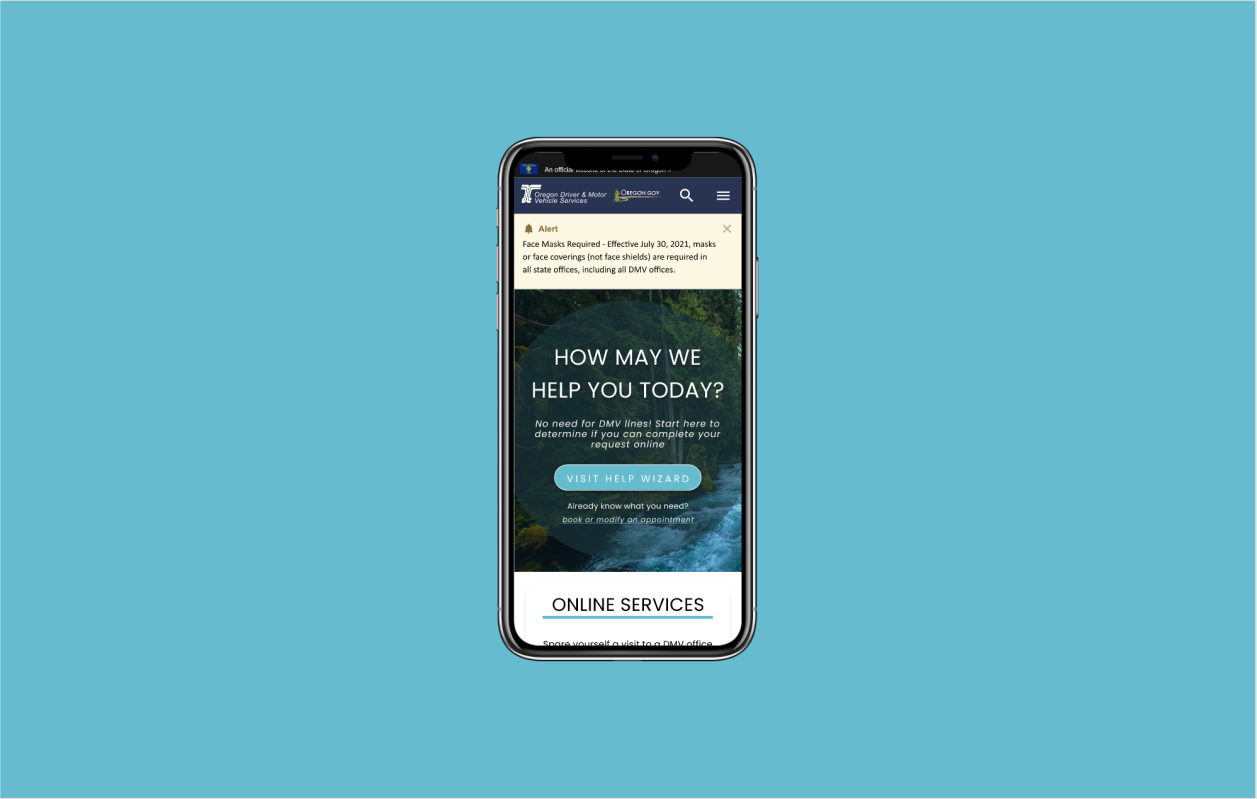
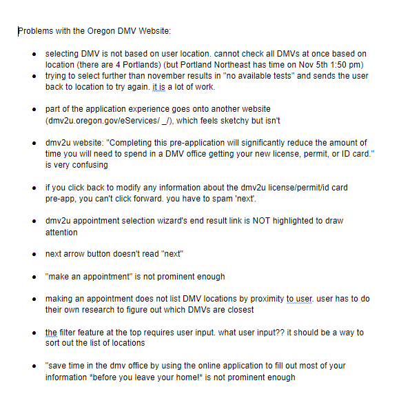
❌ It is unclear that there is a pre-application process that would help reduce the time users will need to spend at the DMV.
🛠️ After signing up for an appointment, users are prompted to fill out the pre-application form to shorten their DMV visit.
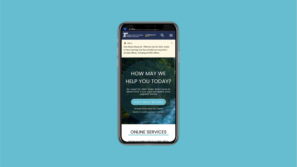
❌ Too many on-screen notifications (especially due to COVID-19 health measures) lead to visual clutter.
🛠️ Important notifications are categorized between informative and mandatory alerts.
❌ The mobile site does not show progress bars.
🛠️ Progress bars added for users' convenience.
Project Reflection
A quick 1-minute presentation in which I cover some of my design decisions.
Thoughts and Reflections
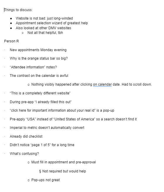
🧑🤝🧑 Users may have biases too! Participants in the usability tests were biased against the DMV and it affected the way they interacted with the wireframe prototype. It is important for me to keep in mind the nature of prior experiences users may have and how they could affect how users view the product.
📐 Think of the edge case users! A feedback I got during critique was to consider how a colorblind person might interact with the prototype; I had used green and red to indicate date availability on the appointment selection page. As a result, I added additional visual indicators to help users with colorblindness identify which dates are or aren’t available. I need to be aware of the scope of users and what their needs might be.


